DasherDirect Cardless ATM Withdrawal
Many Dashers faced challenges accessing their earnings in cash, particularly those relying solely on virtual cards without physical counterparts. To address this, I spearheaded the design and implementation of a Cardless ATM Withdrawal feature, enhancing user experience and accessibility.
Impact
Increased Transaction Volume
Of Cardless ATM Within the first month of launch
Fewer Support Needs
Notable decrease in user complaints regarding cash access with virtual cards.
Context
What is DasherDirect?
DasherDirect is a prepaid debit and mobile banking app for US-based Dashers that provides no-fee payouts after every dash, access to convenient banking functionality, and cash-back rewards.
Where does Revenue come from?
Revenue for Payfare is driven by interchange fees, which occur every time a user makes a purchase with the DasherDirect card.
User Satisfaction and Business Needs
Enhancing user satisfaction was instrumental in encouraging continued card usage and driving revenue growth.​
DasherDirect: key features users are drawn to.
Discovery
The Challenge
How might we enhance Dashers' access to their cash earnings, especially for those without physical cards?
Understanding the Problem
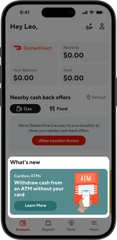
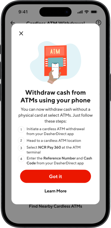
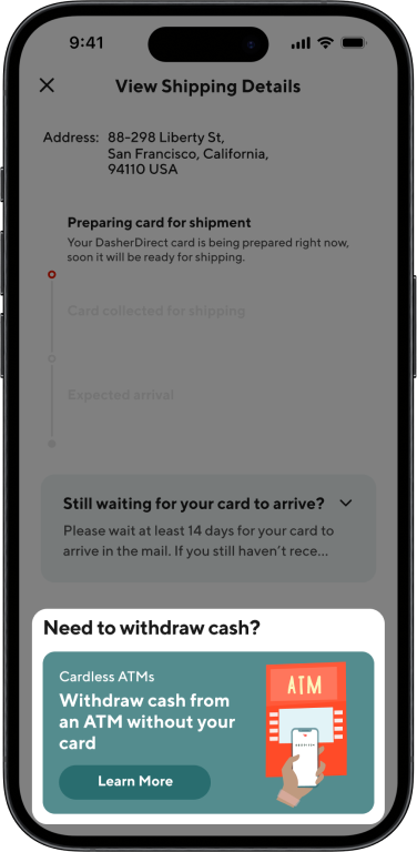
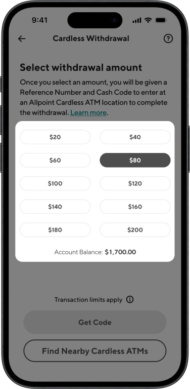
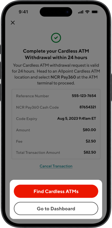
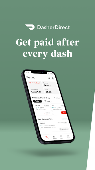
While DasherDirect offers early access to earnings and cashback perks, many Dashers struggle to withdraw cash without a physical card. This gap leads to user frustration, reduced trust, and drop-off—especially for new Dashers who haven't received their physical cards yet.
Why It Matters
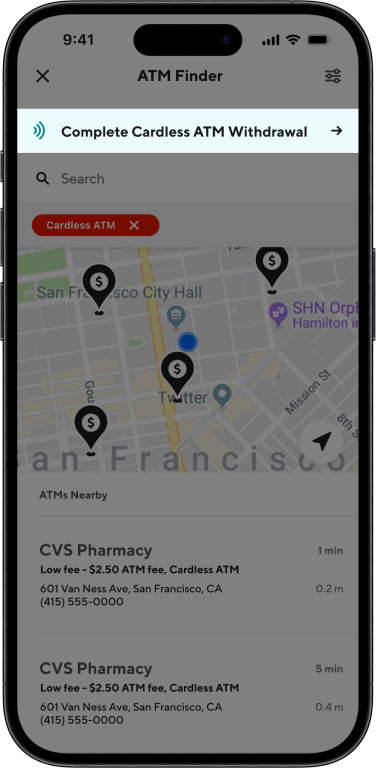
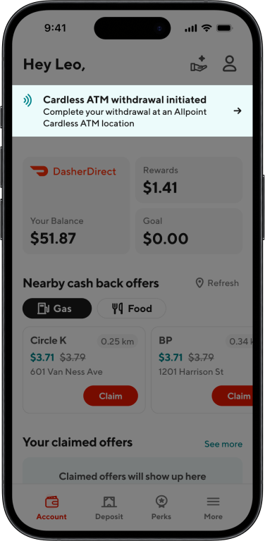
Without a physical card, Dashers have no official way to withdraw cash. This limitation often leads to drop-off, support tickets, or reliance on workarounds. By enabling cardless ATM withdrawals, we created a more dependable path to access funds and strengthened the overall trust in DasherDirect.
Telephonic Interviews
Dashers voiced concern around security when withdrawing cash at retail locations and uncertainty around how to access earnings using only their virtual card. They often felt the app didn’t provide enough guidance.
User Surveys
Survey results showed that fast, easy access to earnings was a higher priority for Dashers than  rewards or cashback features. Many relied on cash for daily expenses and needed more reliable ways to withdraw it.
App Store Reviews
Reviews echoed strong appreciation for instant payouts but, users expressed confusion and frustration around how to get cash without a physical card. This led to dissatisfaction in early app use.
User Reddit Threads
In forums like r/doordash, Dashers often discussed hacks to get cash from stores using their virtual card. Unfortunately, these were inconsistent and unreliable. Many users called out the need for a more official, streamlined solution.
Planning and Ideation
Working Within a Tight Deadline
With a one-week deadline for the initial iteration, strategic prioritization was crucial:​
Requirement Analysis
Delved into the Product Requirements Document (PRD) to grasp constraints and edge cases.
Early Engineering Collaboration
Engaged engineers during the design phase to ensure feasibility and alignment.
User Story Mapping
Structured workflows around user narratives to streamline development and ensure clarity.
Site Map Exploration
To create a seamless experience, I needed to integrate the Cardless ATM Withdrawal feature within existing the site map. Since this was a money movement feature and involved searching for Cardless ATMs, I knew I would have to include the flow within the ATM Finder and Move Money sections.  I started by creating the withdrawal flow and then working backwards to find appropriate entry points - this include an additional tab in the move money section, and an additional filter option in the ATM Finder.
Rough copy of Cardless ATM Withdrawal site map
Exploration
Contextual Awareness for Virtual Card Users
How might we introduce Cardless ATM Withdrawals without confusing users who rely on virtual cards?
A challenge emerged early in the process: users who only had a virtual DasherDirect card (and no physical one) were unsure how to access cash. This came up in Reddit threads and App Store reviews and showed a clear opportunity for better awareness of cardless ATM access. I explored two options:
Draft A
Prioritized a Cardless ATM banner on the home screen. This pushed down the virtual card info and risked confusing new users.
Draft B (Final)
Kept the virtual card banner and embedded Cardless ATM info within it. I also added a “What’s New” section as a secondary entry point.
By embedding this information where users were already looking for card details, I avoided displacing critical content and reduced the chance of user confusion.
Why it mattered: This decision ensured continuity and clarity for virtual card users while introducing a new feature in a low-friction, discoverable way.
Choosing the Right Input for Fixed Cash Amounts
How might we let users select a withdrawal amount with low friction and low error rates?
Cardless ATM withdrawals were limited to $20 increments, capped at $200. This constraint introduced design challenges for input selection. I tested three interaction models:
Input Field
A text input field was error-prone and tedious (e.g., entering $25 would require validation – Eeek!)
Vertical Carousel
A vertical carousel was visually interesting but still introduced friction and potential for mistakes.
Slider
The slider was intuitive but hard to control precisely for such specific increments.
Final approach: I pivoted to a pre-set button system with $20, $40, $60, etc., up to $200. This offered a much faster and error-free experience that aligned with user goals: quick and secure cash access.
Why it mattered: Designing for predictable interactions and avoiding preventable errors directly supported our goal of improving satisfaction and reducing support tickets.
Design
Learnings
Holistic User Perspective
Engaging with user communities, such as Reddit threads, offered invaluable insights into real-world challenges, emphasizing the importance of direct user feedback in feature development.
User-Centric Design
Recognizing that users often bypass manuals underscored the necessity for intuitive design, ensuring features are self-explanatory and user-friendly.​
*https://lawsofux.com/paradox-of-the-active-user/
Cross-Functional Alignment
Early and consistent collaboration across departments proved essential in navigating tight timelines and delivering a cohesive, effective solution.​