Paid App Mobile and Desktop Web App Integration
Paid App is a platform by Payfare designed for clients to pay their workers. To boost user acquisition and remove onboarding friction, I created a mobile and desktop web app integration for Paid App. This removed the barrier having to download an app from the app store.
Impact
2 New Clients
Acquired after ~8 weeks post launch. This took the total client base from one to three.
Decreased time on user onboarding
Clients reported positive sentiment towards the decreased barriers for onboarding workers.
Context
What is Paid App?
Paid App is a digital wallet and banking app by Payfare Inc. that allows businesses, platforms, and marketplaces to pay their workers instantly.
How Workers Get Paid
Workers get a business Visa card and enjoy the benefits of banking with the addition of perks such as rewards, no monthly account fees, and instant access to their earnings.
The Initial Launch
The initial launch of Paid App of 2022 and at the time I started this project in 2024, only 1 client had signed onto the beta-app.
Paid App feature display
Discovery
The Challenge
How might we improve and user onboarding?
Meeting User Expectations
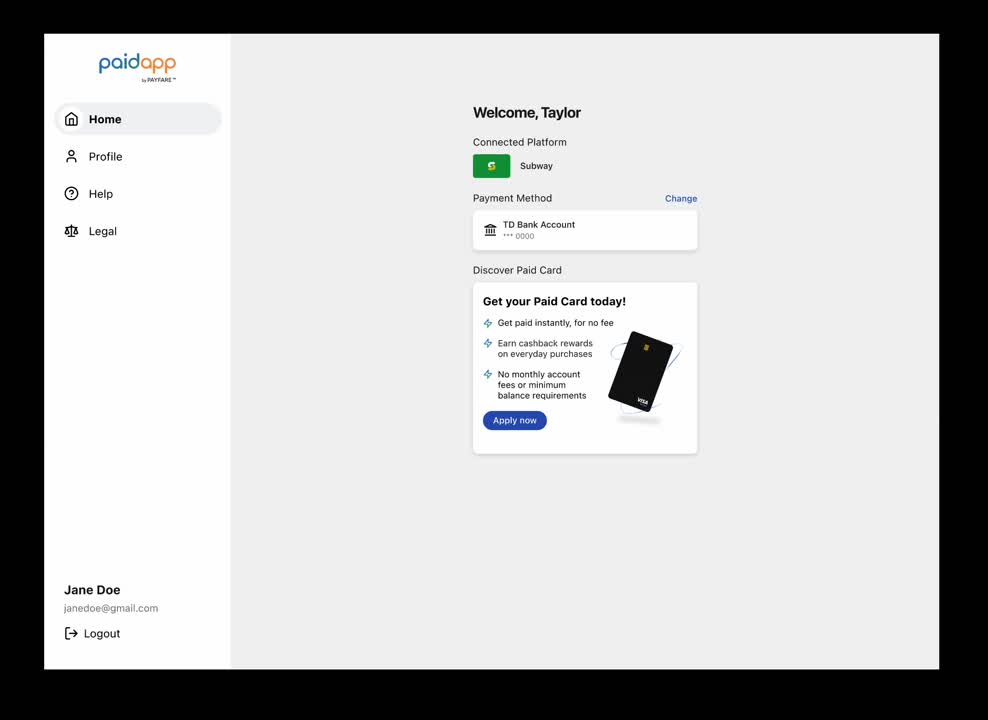
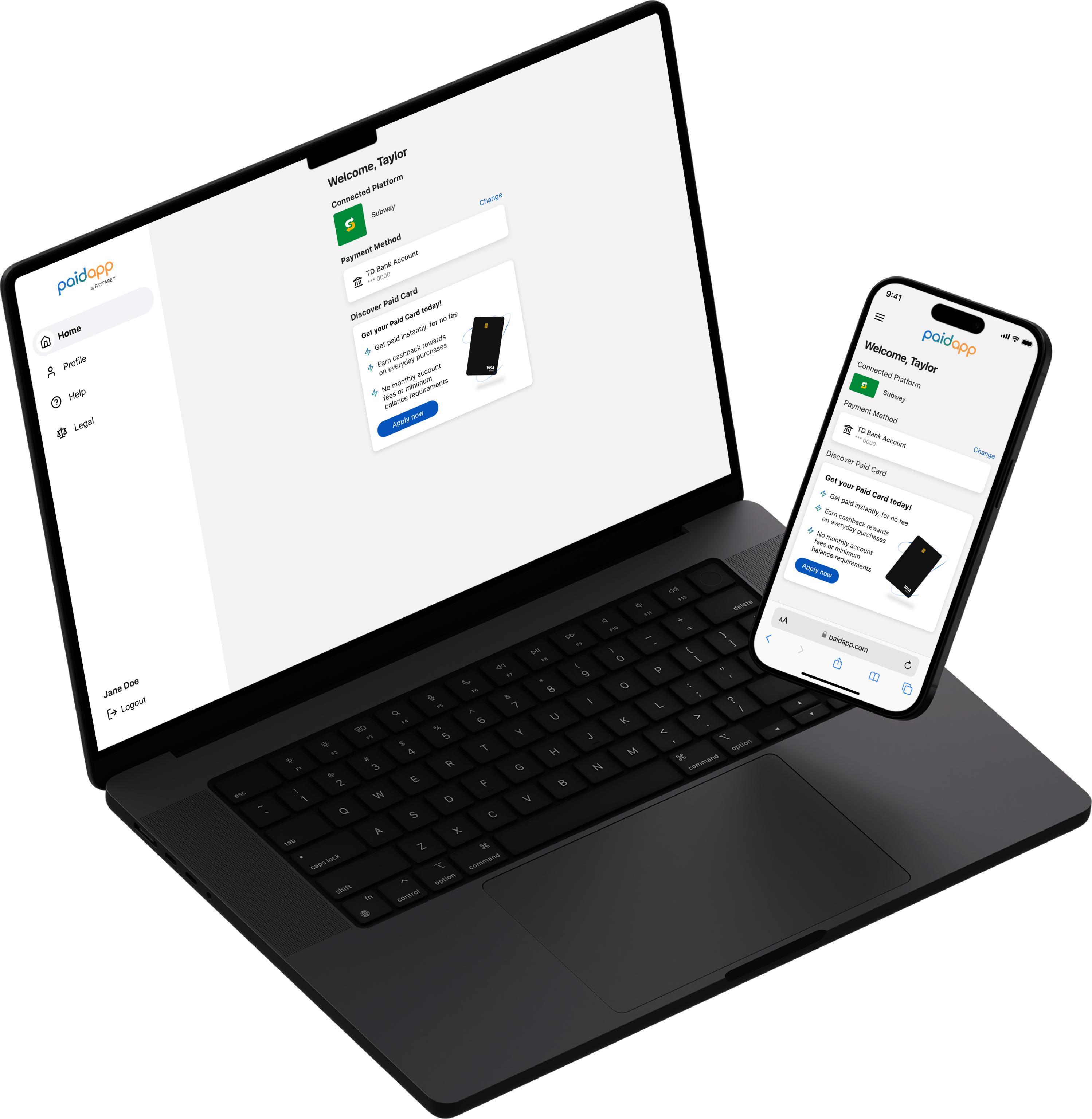
Jacob’s Law suggests that users prefer experiences consistent with ones they already know. Given the presence of other payout platforms, it was crucial to analyze their offerings. Unlike its competitors, the Paid App lacked a web browser experience, making it less appealing to users. Addressing this gap became a key focus of my work.
Usability
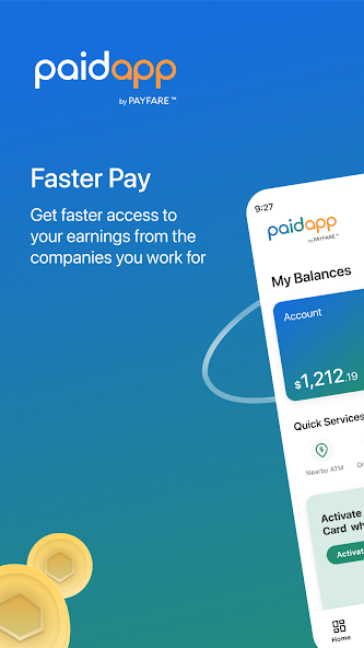
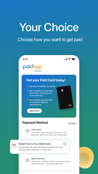
My primary goal was to ensure the Paid App successfully fulfilled its promise of paying workers. Negative app store reviews highlighted potential gaps in the design, prompting me to consider how it might be falling short. As I progressed with the redesign, I recognized the need to investigate potential technical issues that could enhance the user experience. Building trust is essential for financial apps, and addressing these concerns was critical to achieving that.
User Feedback
The initial launch of Paid App was lukewarm. App store reviews revealed workers encountered issues collecting their earnings. Yikes.
Sales Team Feedback
The sales team expressed potential clients were concerned over the friction associated with having to download the app before workers got paid.
Competitor Analysis
I reviewed user feedback from similar competitor experiences, noting that the most satisfied users trusted the app and valued seamless access to their earnings.
Design Audit
Paid App UI hadn’t been updated since it’s initial launch and there was an opportunity to work with the development at QA to ensure that the red routes were functional.
Planning and Ideation
The technical nature of this project required thorough planning and communication with my team members.
Paid Connect, the Web Application
Working with the product team, we collectively decided to separated the new experience into a platform we called, Paid Connect, which would connect users with their gig platform and eliminate the need to download an app.  Paid App will be updated to remove overlapping functionality with Paid Connect, including signup flow and payment method selection.
Payees can payout thier workers
Creating Structure to Start Designing
The Product Manager that I worked with sent me an initial requirements document that I reviewed to ensure we were aligned on our vision of the web browser. During this process, there are a few things I keep in mind:
Create a Shared Vision From the Start
I’ve learned it’s best to ask questions upfront and clarify all requirements and user stories with the PM.  My review added upfront work but helped myself and the PM think through the user experience and avoid potentially unnecessary work later in the process.
Involve the Engineering Team Early
I touched base with the development team after I went over the requirements document with the PM. Since users entered the web browser via a link, it was important to get clarity on the technical implication of failed and successful links. You’ll see I incorporated that later on in the site map.
Designs Organized by User Stories
considering how many edge cases and flows were involved in the web browser app, I made sure to organize my files in user stories. This would make it easier for the development team to reference the Figma files alongside the technical requirements.
A sample of questions and considerations I had while reviewing the requirements document
Site Map Exploration
I separated the new experience into a platform we originally called Paid Connect. Through a web browser, Paid Connect connected users with their gig platform and eliminated the need to download an app.
Paid Connect site map
Design
After a game plan was set, I moved into the design.
The First Iteration
Working together with the product managers, we separated the new experience into a platform we called, Paid Connect. Through a web browser, Paid Connect connected users with their gig platform and eliminated the need to download an app.
Minimal, Plain UI
The product team wanted to create an app that could be sold as an API and integrated into business’ existing platforms. To design a product easy to integrate, I created very minimal, plain designs so the UI could be customizable.
Payment Method Selection
With so much information when it came to selecting a payout method, I decided to only include the most crucial information in each button, and then include the terms and conditions below the selection section.
Issues with the Deeplink
The team ran into issues creating a reliable deeplink that workers connected to via an email to to by their payee. As a result, I had to design additional edge cases for users to connect with their payee manually and consider the experience when the user dropped off early from onboarding. The amount of user stories quickly built up, increasing the scope.
The first iteration of the Paid App web browser, Paid Connect.
The Home page and Connected Platforms page of Paid Connect
The Second Iteration
The complex app architecture and overlapping features between Paid Connect and Paid App created a challenging maze of user flows and versions. To simplify, we decided to build a web browser version of Paid App, a solution that, in hindsight, was remarkably straightforward.
Paid App Integration
To remove the burden of versioning for new and existing users, we determined it would be easier to build a web browser version of Paid App. This approach addressed the issues of having to remove features from Paid App, and instead built on the existing app.
Designing an MVP
To work efficiently, I design an MVP that had less features than Paid Connect. Since the app was still new and didn’t have many users, I designed only payee connection for the MVP. My idea behind this was to focus on how the web app reduces onboarding friction, and leave out other features until later.
Mobile First Design
The desktop app was designed based off the mobile one. I did this to make it easier and faster to design and build. Again, this allowed for more of the attention to be on the results of the onboarding friction, but didn’t take away from the functionality of the app.
Paid App Mobile Web Integration
User onboarding flow
Lorem Ipsum
Paid App Desktop Web Integration
Change payment method and change password
Lorem Ipsum
Learnings
Focus on User Outcomes
I had a hard time not getting stuck in the finer details of this project. I found myself caught up in the issues the team faced with deeplinks not working, or with changes made to how we wanted to promote the product (ie. getting side tracked on the API integration in addition to the web browser). As a designer, I need to keep in mind what the main purpose of the design in - the goal to reduce onboarding friction and I found myself needing to continuously refer back to that.
Setting Clear Expectations
I found it challenging to adapt to the shift from creating a separate web browser product (Paid Connect) to integrating the web browser into Paid App. The experience taught me that my ability to recalibrate and effectively communicate new expectations with the team was just as critical as delivering the designs themselves.